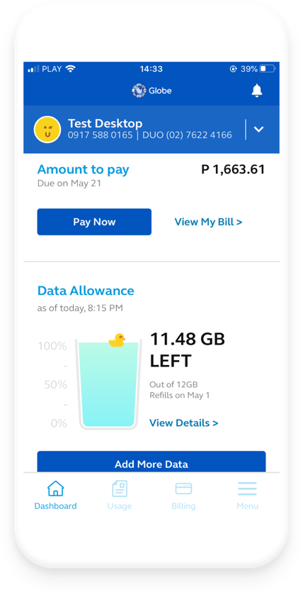
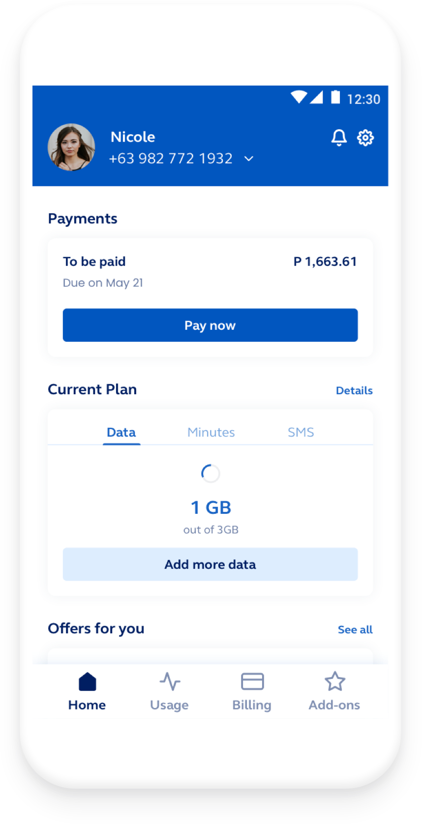
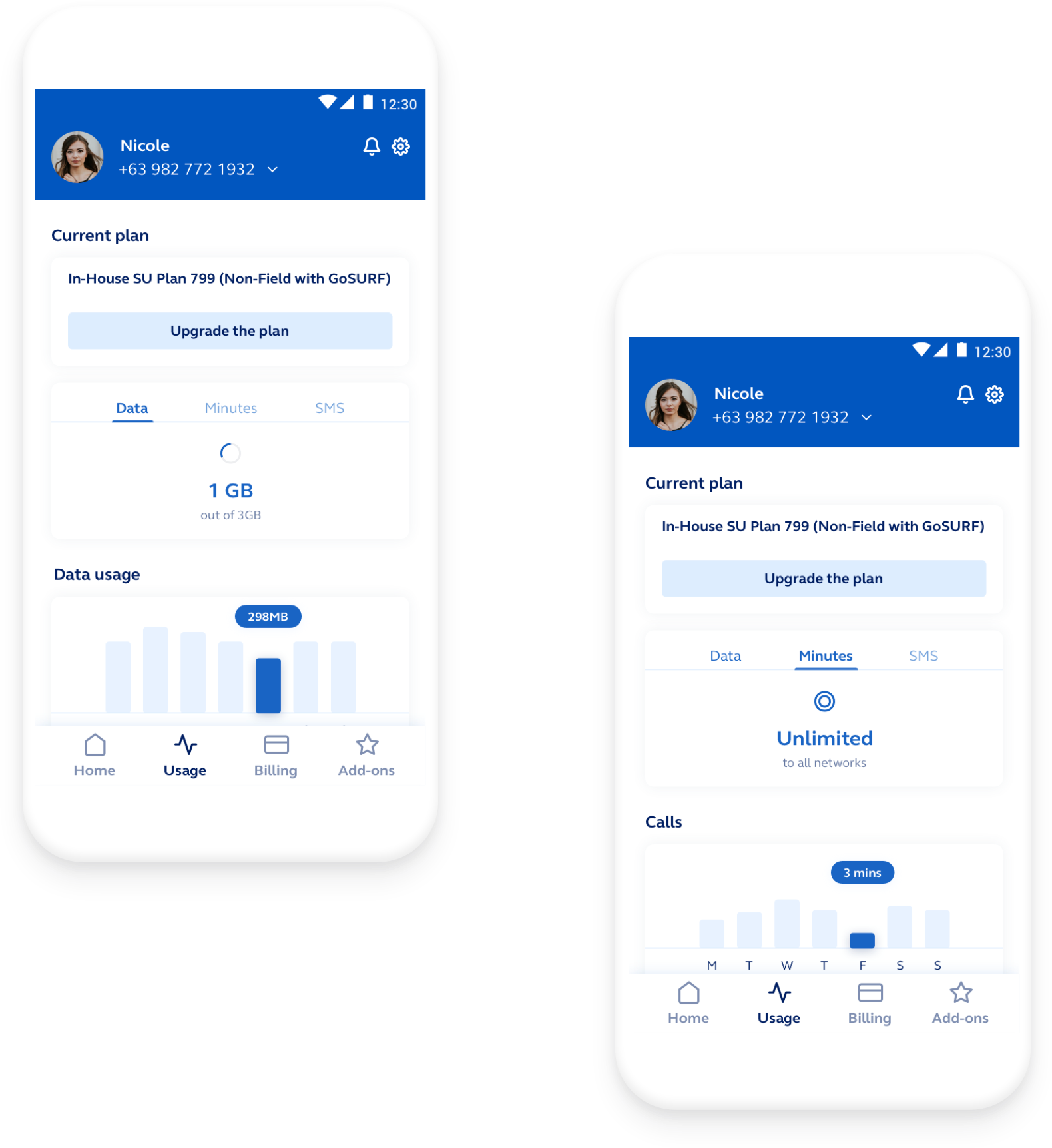
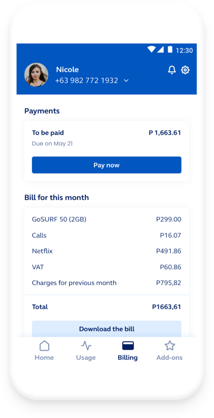
GlobeOne

Mobile application from Globe Telecom – a major provider of telecommunications services in the Philippines.


Heuristic audit

App status visibility


  • The list of individual application functions is visible and mostly clear to the user. However, there is room for improvement, such as removing the “Menu” tab, which includes lots of hidden features. Usually bottom navigation focuses on the most important functionalities and the secondary functions are hidden under the hamburger menu somewhere at the top of the application. Merging this two approaches may cause confusion of the users as the behaviour of the tabs is inconsistent.

Consistency is the key for users to feel confident within the application.

Coherence and standards


  • The size of some texts are too small and can be problematic (e.g.  Charges for the current bill or information when the refill of data is going to happen).
  • The is no clear division between what is clickable and what is not clickable, creating lots of confusion among users. (Billing records is not clickable, although it looks like it; Billing History is clickable, however it looks like a regular text)

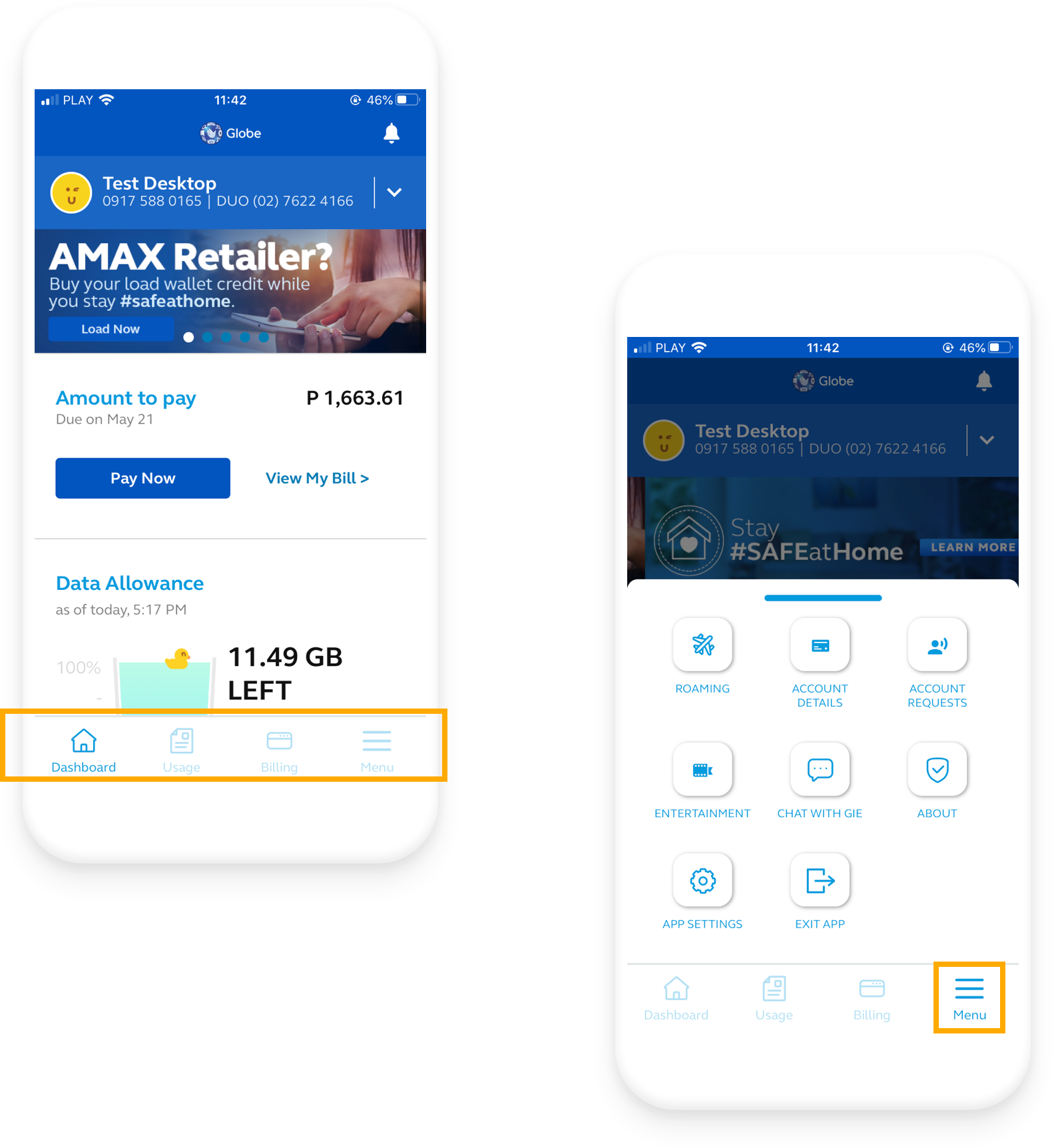
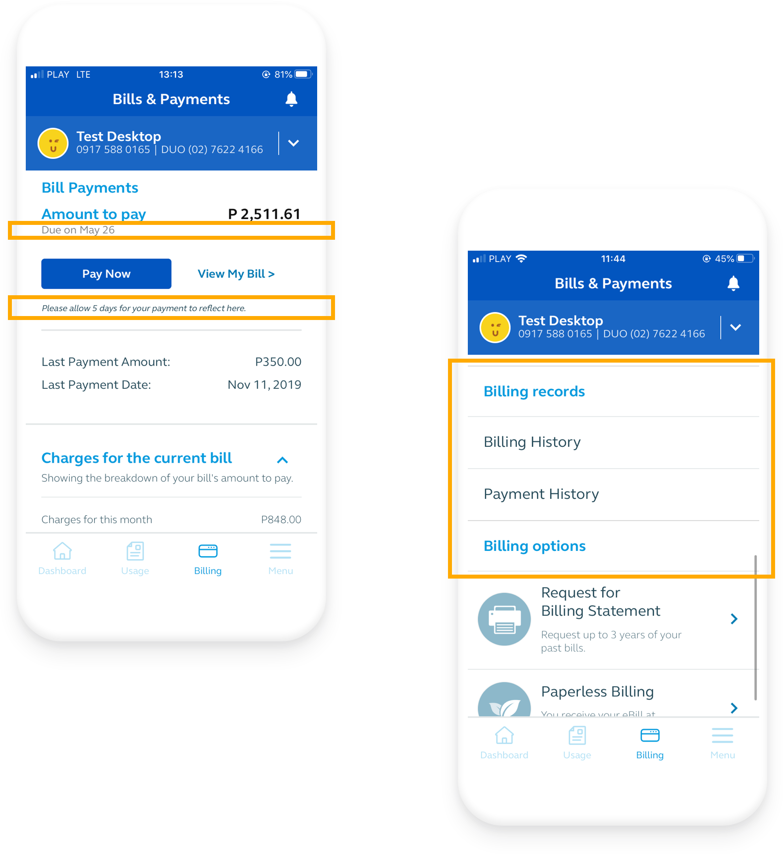
The visual distinction between clickable and non-clickable elements makes it much easier for users to navigate the application.

Error prevention


  • Error in the log in process are presented on the bottom of the screen on the snackbar, which disappears after a few seconds. Message might be bigger or in more vivd colors, so the user won’t miss it.
  • For the most crucial actions like subscribing to an add-on, user is asked for confirmation, which helps users feel confident and in-control in the application.

Errors should have a clear description and be visually noticeable for the user to understand the system status.

Aesthetic and minimalist design


  • Some text styles are very similar to each other, which makes it hard to clearly state the architecture hierarchy of the screens. (“Amount to pay” title is very similar to the button “View My Bill”)
  • The colour palette used in the application meets the accessibility standards, so the text legibility is ensured.

To provide modern look of the application, amount of colours should no exceed 4.

Redesign

Home screen


  • With a reduced color palette and simplified fonts, the whole application looks more trustworthy and aesthetically pleasant.
  • Each section of the content is represented in a card, which makes the screen visually consistent and easy to navigate through. It also makes it easy to add new sections if needed.
  • There is a new tab in the bottom bar, highlighting add-ons instead of squeezing them on any other screen. This way offers are much more accessible and visible for the users and also – easier to explore.
Usage screen


  • Usage tab was designed to focus on tracking the amount of data, calls, and SMS that the user has used over time. By presenting a detailed overview of spending data or calls, the application seems to be more trustworthy.
  • Tracking data and presenting each day usage allows the user to gain a feeling of being in control of his usage of data.
  • By tabs within one of the cards, the user has a full overview of his actions and does not have to search for detailed information in the bill.
Billing screen


  • The billing tab was designed to provide the user information about the current bill in detail, so there are no doubts about the price of the provided services.
  • By showing details of the bill, users can quickly check if everything is all right without spending data on downloading the file with the bill’s details.
  • Presenting such information makes it more accessible to the users and again – emphasizing the credibility of the application and the services. This way the user does not have any doubts about the hidden costs.
Add-on screen


  • Add-ons screen main goal was to provide the user with full information about the offering of GlobeOne. It is a place to gather all add-ons, booster, and bonuses. The screen design was based on the best e-commerce experience.
  • Activated add-ons are presented in the form of a list on the top of the screen. Thanks to that the user has a clear overview of what was bought.
  • Previously used subscriptions are listed below on the scrollable cards, which provide a quick way to subscribe to each of the add-ons immediately.
  • All available extras may be listed similarly, so it would be easy and efficient to discover new offers.