Medicover

An established, well-known private health insurance company.


Heuristic audit

App status visibility


  • List of available tabs and functionalities of the application is visible and easy to understand. There is room for improvements, though. Incoming visits and new test results are currently presented as a number in an orange circle. Such pattern is broadly used as a notification rather than current or future events. Breaking a well-established pattern of mobile applications may lead to confusion among users.
  • Way of presenting past and futurze appointments could also be improved. Currently the only difference between those two is the colour of the date – for past events it is grey, for incoming ones – it’s blue. Such a subtle change may be easily overlooked by users. Additionally, in case a user has planned a future appointment, he can not access past visits easily from the main screen.

Showing number of incoming visits as a notification on a card affects negatively usability of the app.

Coherence and standards


  • Cards on the home screen have almost the same appearance as, for example, test details. Their behaviour is different, though. Home screen cards are clickable, while those within Test details sections – are not.
  • Names of menu tabs are the same as titles of the screens, which increases the learnability of the application.
  • In english version there are limited options regarding new appointments –  there is no way to select whether user would like to have an online visit or come to health center.
  • There is an inconsistent approach to radiuses – cards have different radius than buttons.

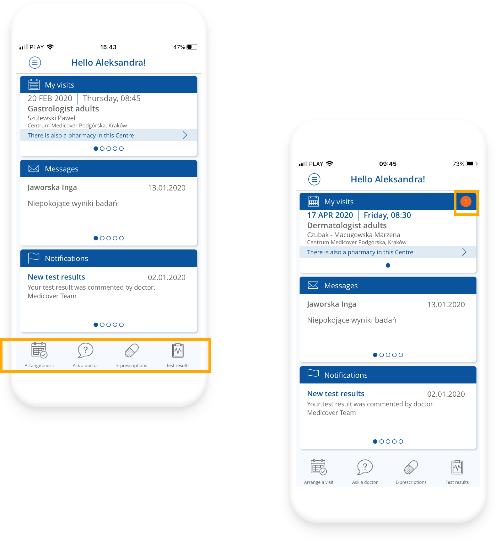
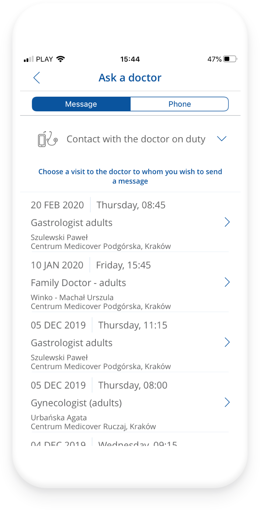
The visual distinction between clickable and non-clickable elements makes it much easier for users to navigate through the application.

Aesthetic and minimalist design


  • Overall, the application seems visually consistent.
  • Used colours and fonts give the impression that the application is “grey”, impersonal and distant.
  • Some texts within the components are very close to each other, giving the impression that the screen is very crowded. Such a layout may raise the feeling of lack of professionalism.
  • The language version has a different layout than the Polish version, which has a negative impact on the user’s experience.

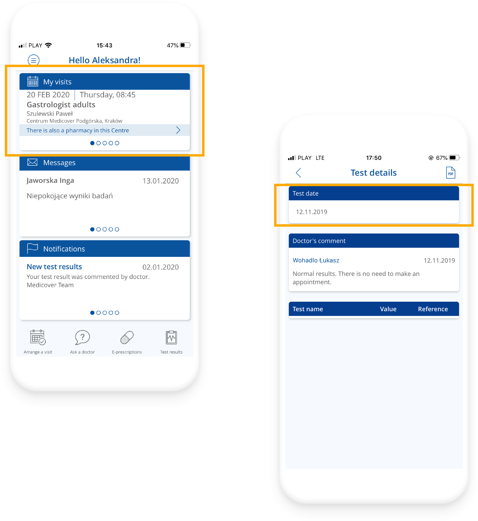
The minimalist design is very clear and easy to use by users if the information architecture in the application is properly defined.

Redesign